
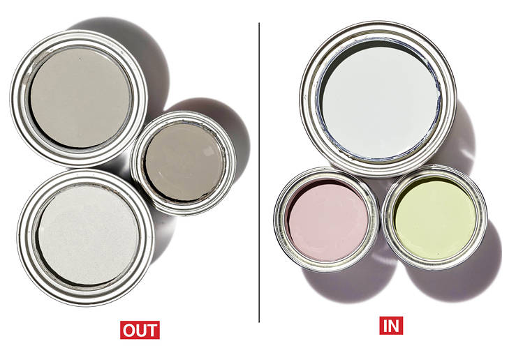
 Moody grays are out and earthy pastel colors are in fashion. “This year will bring more soft pastels, gentle colors that appear in nature, and oak-hued wood finishes,” predicted New York Designer Ámbar Margarida. Fellow New York designer Ghislaine Viñas pointed out that these pastels aren’t pure but rather have been muddied with earthier tones in the mixing process—see Benjamin Moore’s Silver Marlin and Farrow and Ball’s Cinder Rose and Cooking Apple Green, shown above.. “We’ll see mint greens mixed in with jades and sages and other combinations working off some very grounded mustard tones,” she added.
#dreamlandinteriors #paintcolors #BenjaminMoore #oak #pastels
0 Comments
These are the worst colors for an interior wall according to Maxwell Ryan who writes for Apartment Therapy.
#dreamlandinteriors #paint #interiorwallcolor
A young girl would love this soft millennial pink colored sofa/sectional. I especially like the way the pictures are displayed on the wall. Great use of space and color. Source: Glamour. 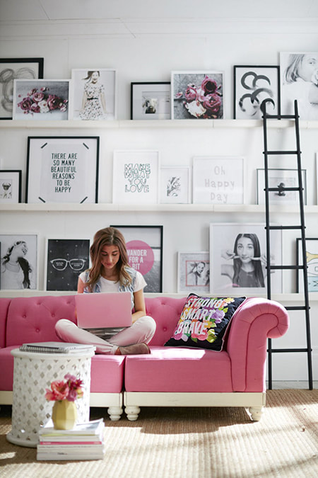 #dreamlandinteriors #sofa #wallart #millennialpink
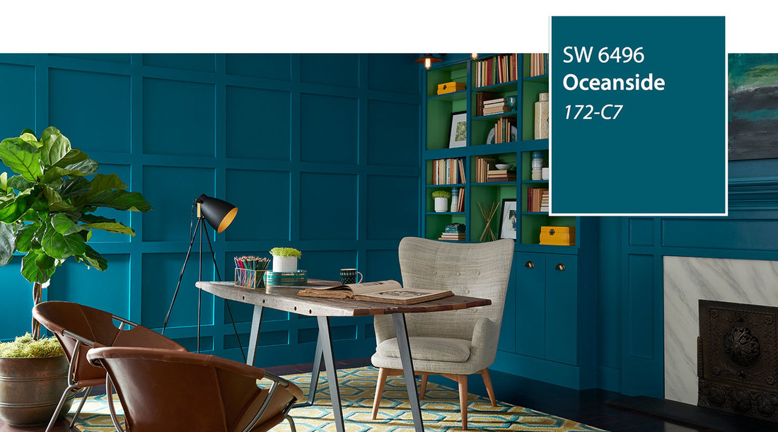 2018 Color of the YearA collision of rich blue with jewel-toned green, a color that is both accessible and elusive, Oceanside SW 6496, is our 2018 Color of the Year. A complex, deep color that offers a sense of the familiar with a hint of the unknown, Oceanside, bridges together a harmonious balance of blues and greens that can be found in what's old and new.
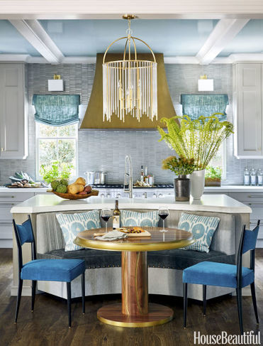
The color blue evokes a multitude of moods and associations depending on hue, shade and application. Despite this variety, blues are universally perceived as intelligent, honest and interesting—making blue the most beloved color worldwide. Oceanside's multi-dimensional, marine-inspired look can create a welcoming statement as a lively color for a front door. Its green-meets-blue tone can also boost creative thinking and clarity of thought in a home office, or invite meditation and introspection into a bedroom or reading nook. Oceanside is universal when it comes to design style from mid-century modern to Mediterranean-inspired, traditional to contemporary. Using the Sherwin-Williams ColorSnap® Visualizer, you can explore the Color of the Year and with the swipe of a finger see it on any wall. From: Sherwin-Williams Implement the 50/150 rule. For the perfect color family, mix one batch of paint 50% lighter than the base and another 150% darker. "That's a failsafe method for striping a wall," says Mary Douglas Drysdale, who designed this bold blue kitchen. "It's also a very architectural way of using color." 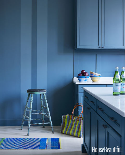 #dreamlandinteriors #HouseBeautiful #color #paint #blendingpaint
Sherwin Williams' color theme forecast for the year will be defined by a sense of restless energy. The new paint colors are showcased in four color palettes: Noir, Holistic, Intrepid, and Unbounded. Each group contains ten colors. The Noir palette colors "evoke vine-ripen fruits, Nordic blues, moody neutrals, and golden yellow. The Holistic palette colors consist of arctic neutrals, blush rose, wild browns, and forest floor green. The Intrepid palette colors are composed of fiery oranges, vibrant kimono colors, blacks, whites, and grays. The last palette titled Unbounded contains the shades of earthy mustards and earthy browns, ocean blues and corals. To explore more information about these new colors, visit the Colormix site.
#dreamlandinteriors #paintcolor #SherwinWilliams #colorpalette #painting #remodeling #homedesign It is much easier to paint in interior room than to paint a structure outdoors. Painting a room is the easiest way to improve and change the atmosphere in a room. Choose a color based on your intention for painting. Are you looking for the dramatic effect, to brighten the space, or to set a relaxing tone? Armed with this information Dreamland Interiors, Inc. will help you choose the perfect color combination. First gather your supplies: screwdriver, drop clothes, sponge and clean rags, paint brushes angled and straight, paint roller, ladder, sandpaper, spackle, dust mask, plastic wrap and rubber band to cover brushes or rollers if job is interrupted, putty knife, painter's tape, primer, paint, paint buckets, solvent if oil based paint, jars for soaking brushes. Or you could just have us schedule the painters to complete the project. Remove or cover furniture, remove items from walls, cover floor, wrap plastic wrap around fans or light fixtures, cover door knobs. Paint will adhere to the walls better if they are clean. Use water and mild dish detergent and sponge to wipe down walls. Fill cracks with spackle or compound and sand smooth. Always check the product instructions before beginning. Apply the primer. Professional painters even tint the primer to make the actual application of the main color easier to apply. Apply painter’s tape to cover areas not to be painted, pressing the edges as you go with a putty knife. As you paint each surface, carefully remove the tape before the paint dries. Dampen brush and rollers before painting. Start with the ceiling. You may want to use an extension on your roller. For brushwork use a small bucket. They make them with handles for added convenience. For rollers, partially fill a tray. Cut in about 3 to 4 inches around the ceiling where it meets the wall, starting in a corner. Apply the remainder of the paint on the ceiling with a roller. Let the ceiling dry before painting the walls. Latex paint usually takes 2 hours to dry. Oil based paint needs 24 hours to dry. You can be taping the door frames and windows, etc. while you are waiting for the ceiling to dry. Use the cutting-in technique to paint a strip along the edges at the ceiling, baseboards, doors and windows on the first wall. Paint the wall with a roller. Repeat steps with the remaining walls. Be checking often for runs or missed spots before the area dries. After the walls are painted and completely dry, use painter's tape around the trim and windows. Use a smaller brush about 2 inches wide for the baseboard and the trim around doors and windows and paint with long, even strokes. It is standard to apply two coats of paint, but it may not be necessary in all cases especially if you use one of the new paints with primer in the paint.. When finished, clean your brushes, rollers and other tools with soap and water or paint solvent according to the manufacturer’s instructions. Pour any remaining paint back into cans and reseal the cans. I use a marker and label the cans for easy future reference. I also make a small jar of touch-up paint which I also label and keep in handy spot. #dreamlandinteriors #paint
#interiordesign #interiordesigner #decor #homedecor #interiorstyling #homestyling #interiors #designblog #homestyle #homesweethome #redesign #remodel #interiordecor #homedesign #decorate #furniture #kitchen #livingroom #bedroom #bathroom #diy #construction #realestate #interiordesigners #decorator #styling #homedecor #creative #home
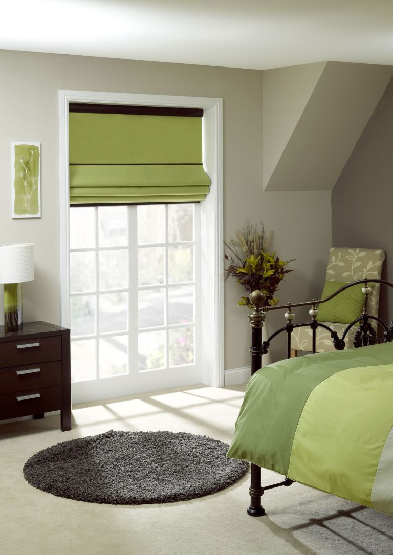
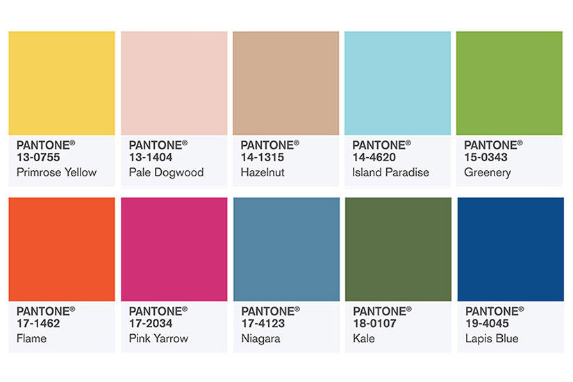
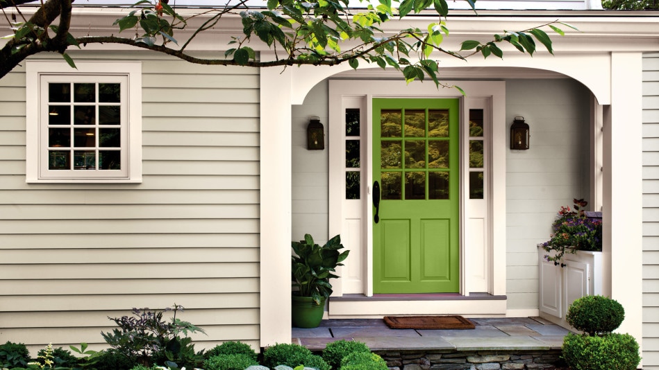 Pantone Color Institue has chosen their color pick for 2017. It is called "Greenery" and is a yellow-green hue that reconnects us with nature. How many places can you find to add this nurturing color? #dreamlandinteriors #Pantone #interiordesign #interiordesigner #decor #homedecor #interiorstyling #homestyling #interiors #designblog #homestyle #homesweethome #redesign #remodel #interiordecor #homedesign #decorate #furniture #kitchen #livingroom #bedroom #bathroom #diy #construction #realestate #interiordesigners #decorator #styling #homedecor #creative #home
|
Natalie A. GauciLicensed Interior Designer working in the Tampa Bay, Florida area. Archives
October 2018
Categories
All
|
 RSS Feed
|
#stagingthedream
Dreamland Interiors...
|
|

© Dreamland Interiors, Inc. 2024